Main Navigation
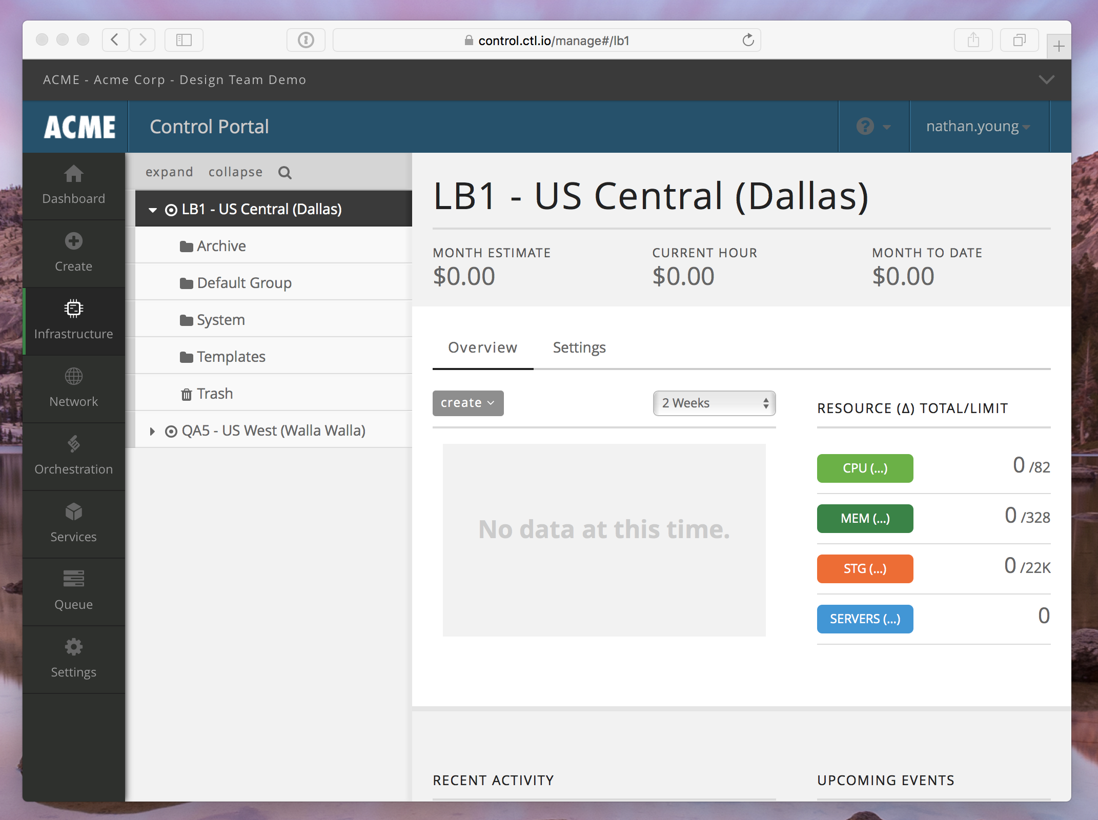
Using the navigation bar along the left side of the page, we have organized services and settings into eight categories, each containing links to services and settings that fall within each category.
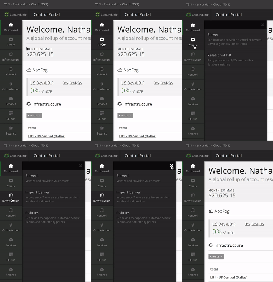
- Dashboard
- Create: a menu for quickly provision servers or services
- Infrastructure: manage your servers by data center
- Network: network and ip address management
- Orchestration: Blueprints
- Services: Relational DB
- Queue: blueprint queue
- Settings: account settings, user management, branding and theming
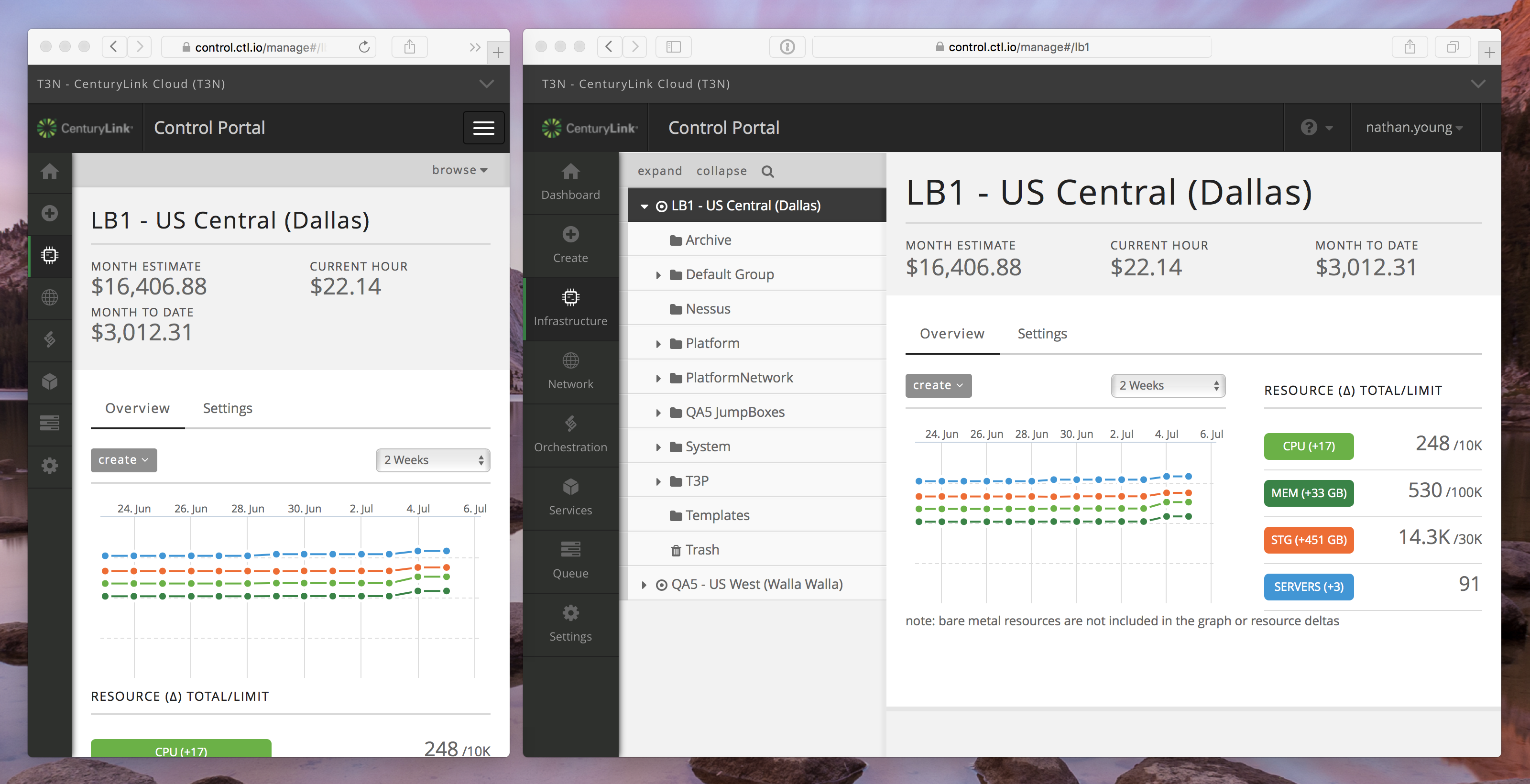
This new navigation bar is designed to be responsive, so whether you use a desktop or mobile device to browse the Control Portal, it will adapt itself appropriately. We’re working to make all areas of the site responsive as well.
Sub-Account
If you are a customer that happens to use our sub-account feature, there is a new sub-account navigation menu at the very top of the page. This displays your current account name and alias, giving you context for the data on the page below. To open the menu, click the account name (or press ctrl + i on your keyboard) to view the entire account hierarchy your user has access to.
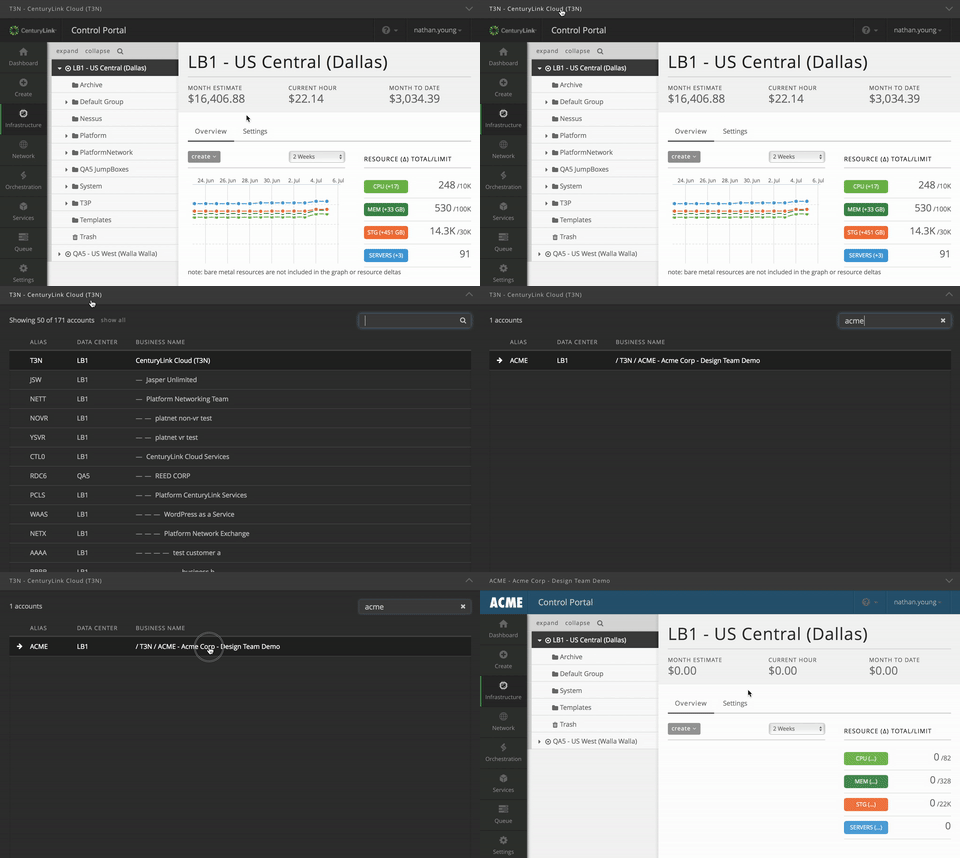
If you belong to a large organization with a long list of accounts, you can filter the list of accounts by account name or alias using the filter input box to quickly change account context. The full account hierarchy for each sub-account is displayed, so it is easier to understand what sub-account belongs to whom.
Help and Support
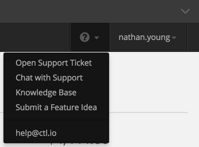
To access help and support options, a menu is available at the upper right next to the username of the person currently signed in. Clicking the question mark icon will reveal your support options.
Custom Colors and Logos
The most commonly customized color option (header bar color) has been maintained, and we have removed the rarely used, or confusing options. The logo, favicon, and mobile icons have remained unchanged. If you wish to update the color scheme of your account after seeing the navigation update, view your organization color settings page.
We’re really excited to share the upcoming design with you, and we’ll be iterating on it based on your usage and feedback. We understand that site changes can be disruptive, but we believe this is an important and beneficial change that will improve your experience of using the Control Portal.
